
Prepare Print-Ready Files for Digital Printing
General, Printing
How to Prepare a Truly Print‑Ready File for Commercial Digital Printing
Nothing feels worse than opening a fresh box of prints and spotting crooked borders, fuzzy photos, or a logo sliced a little too close to the edge. Those problems almost always trace back to how the file was set up, not the printing press.
Use this step‑by‑step guide to set up sizes, bleed, safe zones, fonts, and image resolution correctly so your printed pieces look clean, sharp, and professional on the first try.
1. Choose the Correct Final Size (Trim Size)
The final size of your piece, also called the trim size, is the size after the printer cuts it down. Start by confirming this size with your print shop (for example, 5" × 7" postcard, 8.5" × 11" flyer, or 3.5" × 2" business card). Set your document to this final size in your design software before adding any content. Avoid creating artwork on a larger canvas and hoping it can be scaled later. Resizing at the end can distort images and text or throw off margins and folds.
💡 Pro Tip: Name your file with the trim size in the title so you can quickly confirm you are working at the correct dimensions.
Most commercial digital printers will also provide templates or size charts. When in doubt, ask for a template for the exact product you are ordering and build directly on top of it to avoid guesswork.
2. Add Bleed: Extend Artwork 0.125" Beyond the Cut Line
Bleed is extra artwork that extends past the final cut edge of your piece. It ensures that when the stack of paper is trimmed, you do not end up with thin white edges where the blade may shift slightly. A common standard for commercial digital printing is 0.125" (1/8 inch) bleed on every side.
For example, if your final trim size is 8.5" × 11", your document size including bleed should be 8.75" × 11.25". Any background colors, photos, or design elements that should go all the way to the edge must be extended into this 0.125" bleed area. If they stop right at the trim line instead, you risk visible slivers of unprinted paper after cutting.
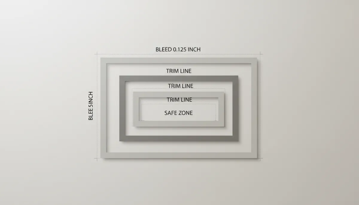
Use bright guides or colored frames when you set up bleed so you can clearly see what will be cut off.
3. Respect the Safe Zone: Keep Key Content 0.125" Inside the Cut Line
While bleed protects the outer edges, the safe zone protects your important content. The safe zone is an inner margin where you keep all critical elements such as logos, text, contact details, and key graphics away from the trim edge. A common guideline is a 0.125" (1/8 inch) safe zone inside the cut line on all sides.
Using the same 8.5" × 11" example, imagine a rectangle that is 8.25" × 10.75" centered inside your page. That inner rectangle is your safe zone. Anything placed outside it could look crowded near the edge or risk being trimmed off. Leaving this breathing room gives your layout a professional, balanced appearance and accounts for minor cutting shifts.
📌 Key Takeaway: Colorful borders and background blocks can sit in the bleed area, but text and logos should always live comfortably inside the safe zone.
4. Embed or Outline Fonts So Nothing Reflows
Fonts are a frequent source of print surprises. If your printer does not have the exact same fonts installed, your carefully designed layout can reflow. Lines may break differently, text may shift, or a substitute font can appear. To avoid this, you must embed your fonts when exporting to PDF or convert text to outlines or curves, depending on the software you use.
When saving a PDF for print, choose a preset such as “High Quality Print” or “Press Quality,” and make sure the option to embed fonts is enabled. If your design program allows it, converting final text to outlines before export is another safe approach, especially for headlines and logos. Just remember to keep an editable version with live text for future changes.
“If your brand colors and fonts matter on screen, they matter even more in print.”
— Your print file, speaking from experience
5. Use High‑Resolution Artwork: 300 dpi at Final Size
Commercial digital printers produce sharp results only if your images are high enough resolution. The standard for quality print is 300 dpi (dots per inch) at the final printed size. That means a photo that will print at 4" wide should be at least 1200 pixels wide (4 × 300). Low‑resolution images, typically 72 dpi web images grabbed from websites, will look soft, pixelated, or blocky when printed.
Before placing images into your layout, check their resolution in your image editor. Avoid scaling small images up inside your design software to make them fit. Enlarging them there does not add detail, it only stretches the pixels. When in doubt, supply the highest‑resolution original file you have and let your printer advise you on suitability.
💡 Pro Tip: Vibrant, full‑color photos look best when they are both high resolution and color corrected in CMYK for print.
Final Pre‑Flight Checklist Before You Submit
Confirm the document size matches the final trim size requested by your printer.
Make sure bleed is set to 0.125" on all sides and all edge‑to‑edge artwork extends into it.
Keep text and logos within a 0.125" safe zone inside the cut line so nothing important is trimmed.
Embed or outline all fonts before exporting your final PDF so your layout does not change.
Verify all placed images are 300 dpi at the size they will print, not just at their original size.
If you follow these guidelines for proper sizes, 0.125" bleed, a 0.125" safe zone, embedded fonts, and 300 dpi artwork, your file will be truly print‑ready. That means fewer delays, fewer questions from the print shop, and a final piece that looks exactly the way you imagined it when it comes off the digital press.
In practice, that can be the difference between:
A business card run where your logo is perfectly centered, colors are rich, and every edge bleeds cleanly to the trim.
Or a rushed reprint because the first batch came back with fuzzy photos, misaligned borders, and tiny text too close to the edge.
📌 Key Takeaway: Treat every project, whether it’s a simple postcard or a multi‑page booklet, as if it’s going straight to press today. Build good habits now, and “print‑ready” will become your default, not a last‑minute scramble.
